A Screenshot, Some Colours and a Scheme

Quite a while ago, Miniac posted a video where he used a photo as the basis for a colour scheme. Others have also visited the same idea, but it’s an interesting concept and it struck me as a fun way to find interesting new colour schemes to try.

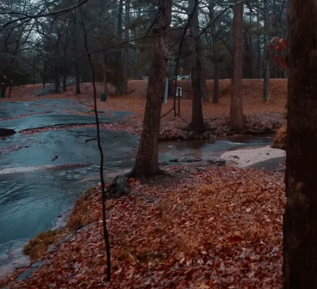
Recently, I had a background ambience video walking through a forest in a northern-hemisphere autumn, and something about the colours was very striking. The orange of the autumn leaves contrasted beautifully with the almost iridescent blue of the rocks, stone and river. The brown of the trees also looked nice, and gave me a good third colour to round out my scheme.

A wonderfully vibrant forest photo, just waiting to become a paint scheme

When it comes to picking paints, I originally expected the orange would start with a brown. But when I examined the photo more closely, I could see that the red tones are surprisingly strong amidst those leaves, so I chose to start with a dull red and shade up through orange.

For the blues I started quite dark, using a very dark blue-black as my base, and shading up to Deep Ocean (a dark teal) . This ultimately didn’t have enough contrast though, so I wound up also using a bit of Marine Teal as well just to push the highlights a bit higher. For the browns I went with a simple range of earth browns to get the colours I was looking for. This tended to be the background colour of my schemes, filling in where it made sense but not really being the focus.

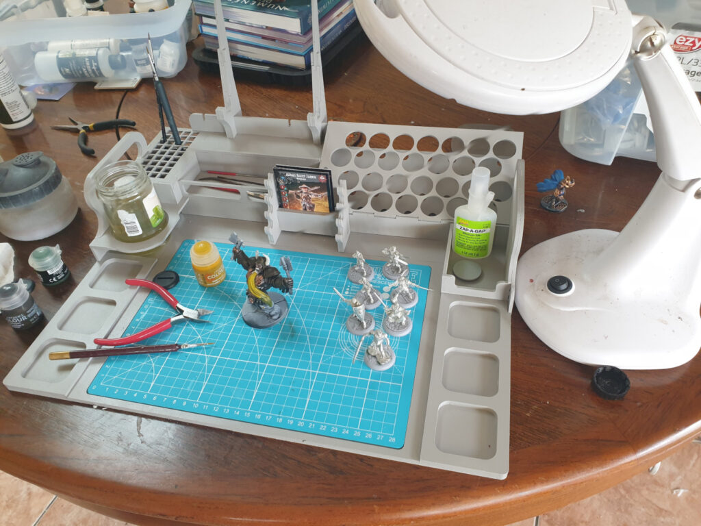
Expand for detailed paints list

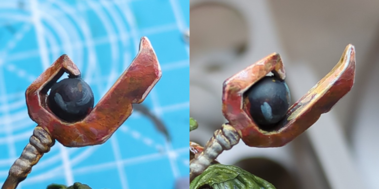
Orange: RMS Clotted Red (#09134), VMC Mahogany (#70846), RMS Redstone Highlight (#09225), RMS Highlight Orange (#09243)

Blue: RMS Nightmare Black (#09280), VMC Dark Sea Blue (#70898), RMS Deep Ocean (#09076), RMS Marine Teal (#09077)

Brown: RMS Dark Shadow (#09040), RMS Muddy Brown (#09028), RMS Dark Highlights (#09042)

Abbreviations: RMS is Reaper Master Series, VMC is Vallejo Model Colour
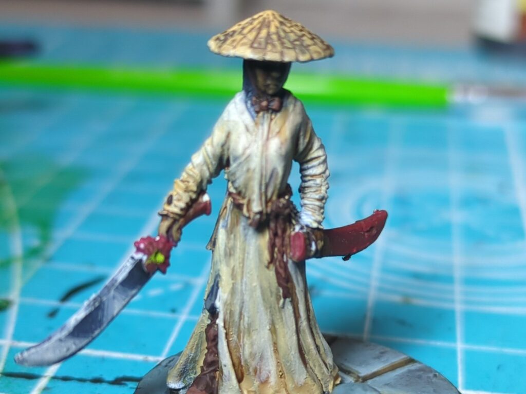
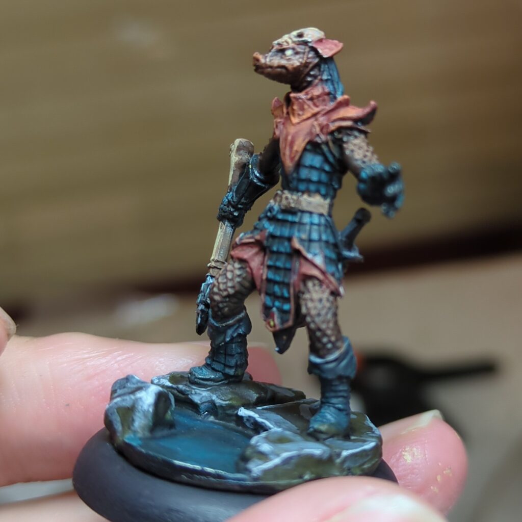
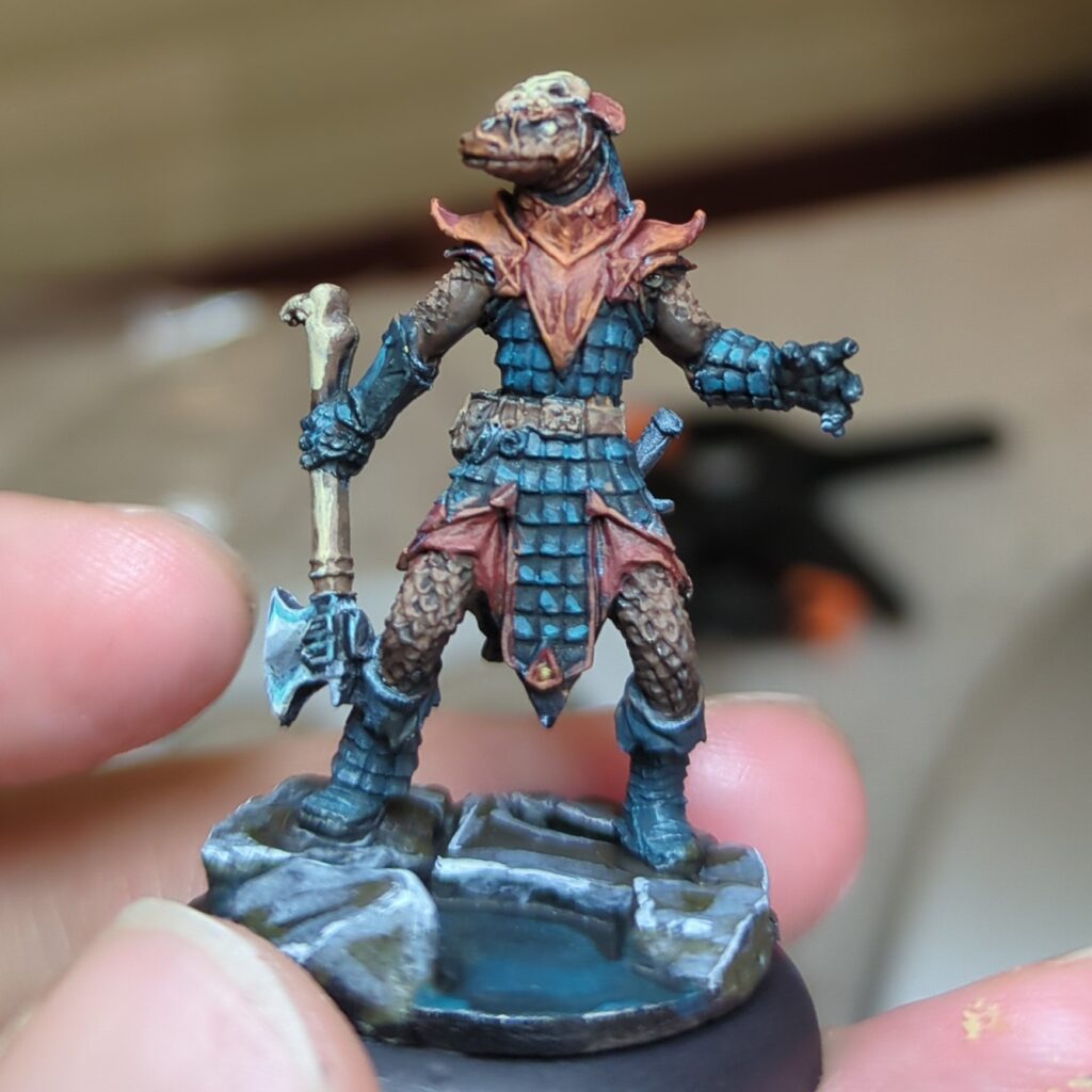
The Lizardman

The first model I tried this colour scheme out on was a lizard man figure (Degenerate Serpentfolk from Reaper Minis). I went with the blues for his scalemail armour, with the orange used for most of the trim and details. I reserved the browns for the leggings and sleeves (as well as his flesh).

I’m pretty happy with this overall combination. It’s pleasing to the eye and yet a little bit novel. While I don’t think it’s a exact match to the photo, I don’t think I would have thought of this colour scheme if I hadn’t tried this exercise – so I consider this to be a success.

The Pirate

The second model I applied this too was an old Pirate mini that’s been sitting in my backlog for quite some time. From memory he was part of a set I fished out of a bargain bin long ago.

I did end up changing the colour scheme up a bit on this one, mostly because he was wearing a ruffled poets shirt that wouldn’t look right if it wasn’t white. The mahogany went well for his coat and jacket, with the teal providing a wonderful contrast for his hat, sash and pants. The darker brown didn’t end up making it into the composition.

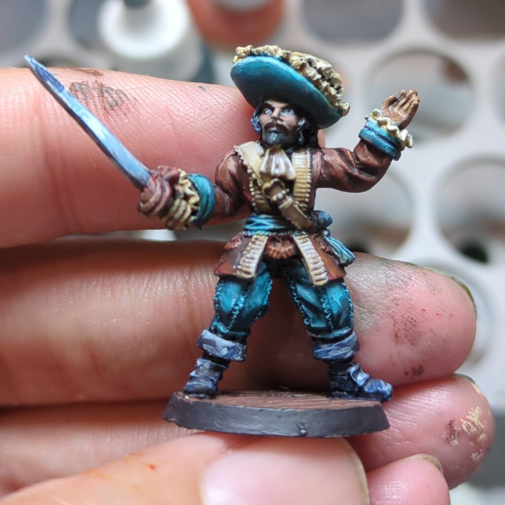
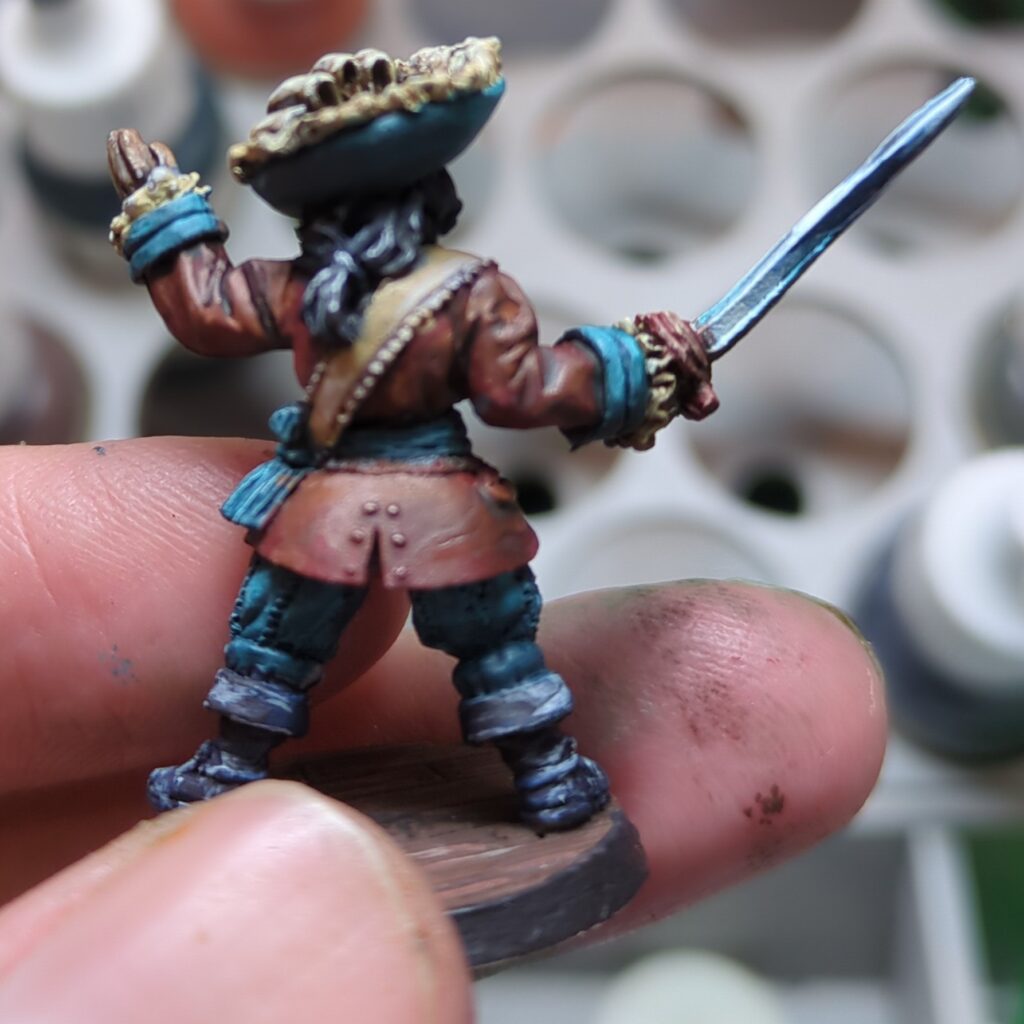
I did put a bit more effort into pushing the contrast with this figure, which paid off and I’m very happy with the result. It definitely helps the mini pop.
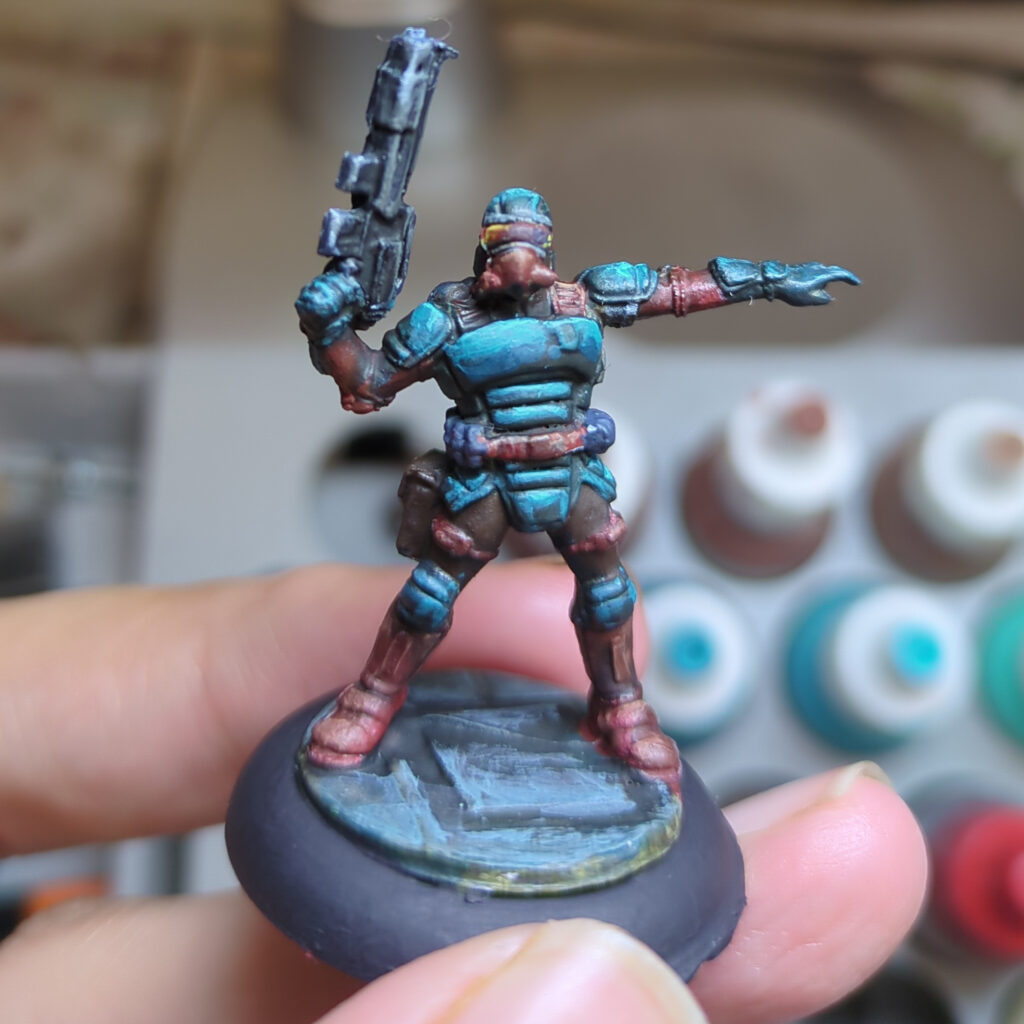
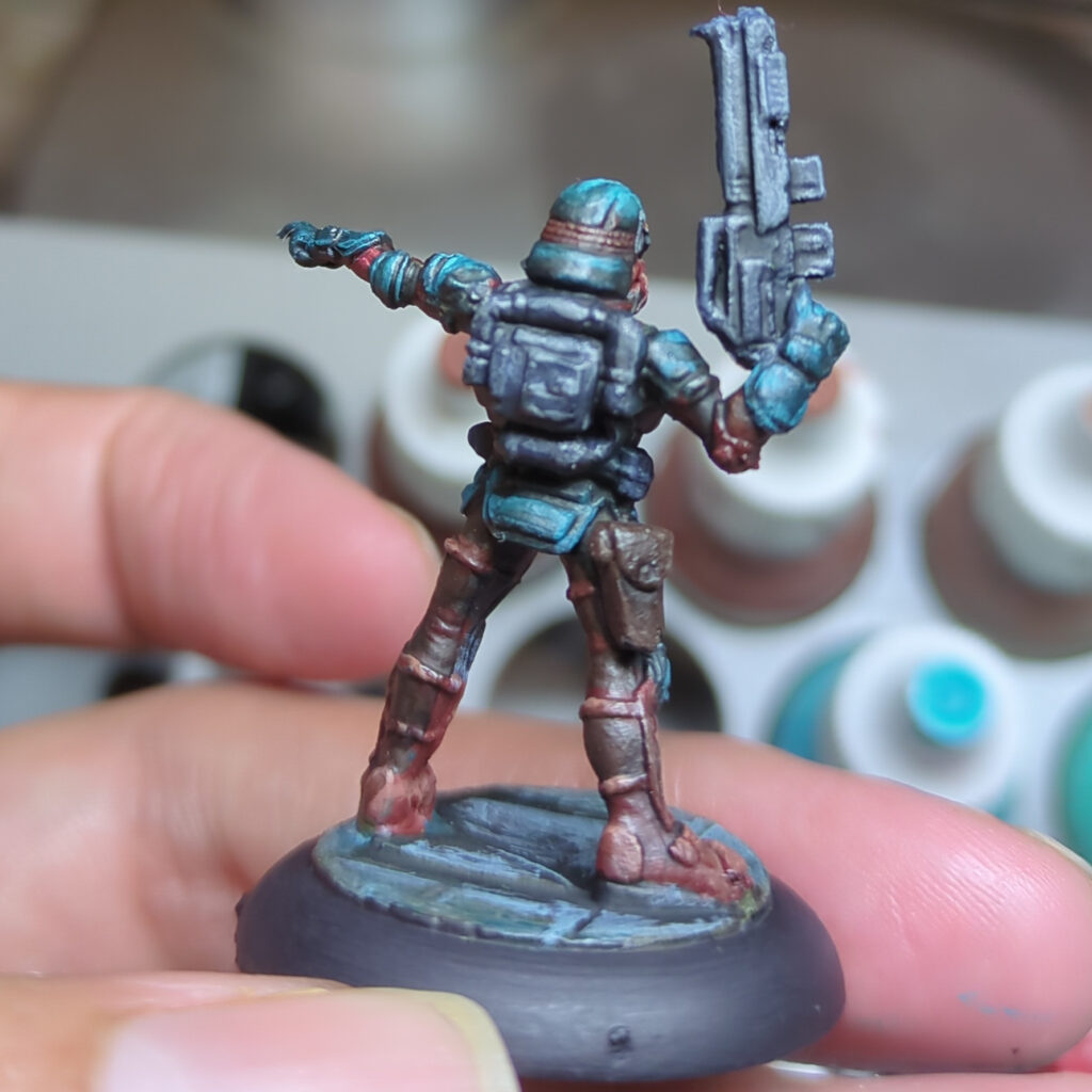
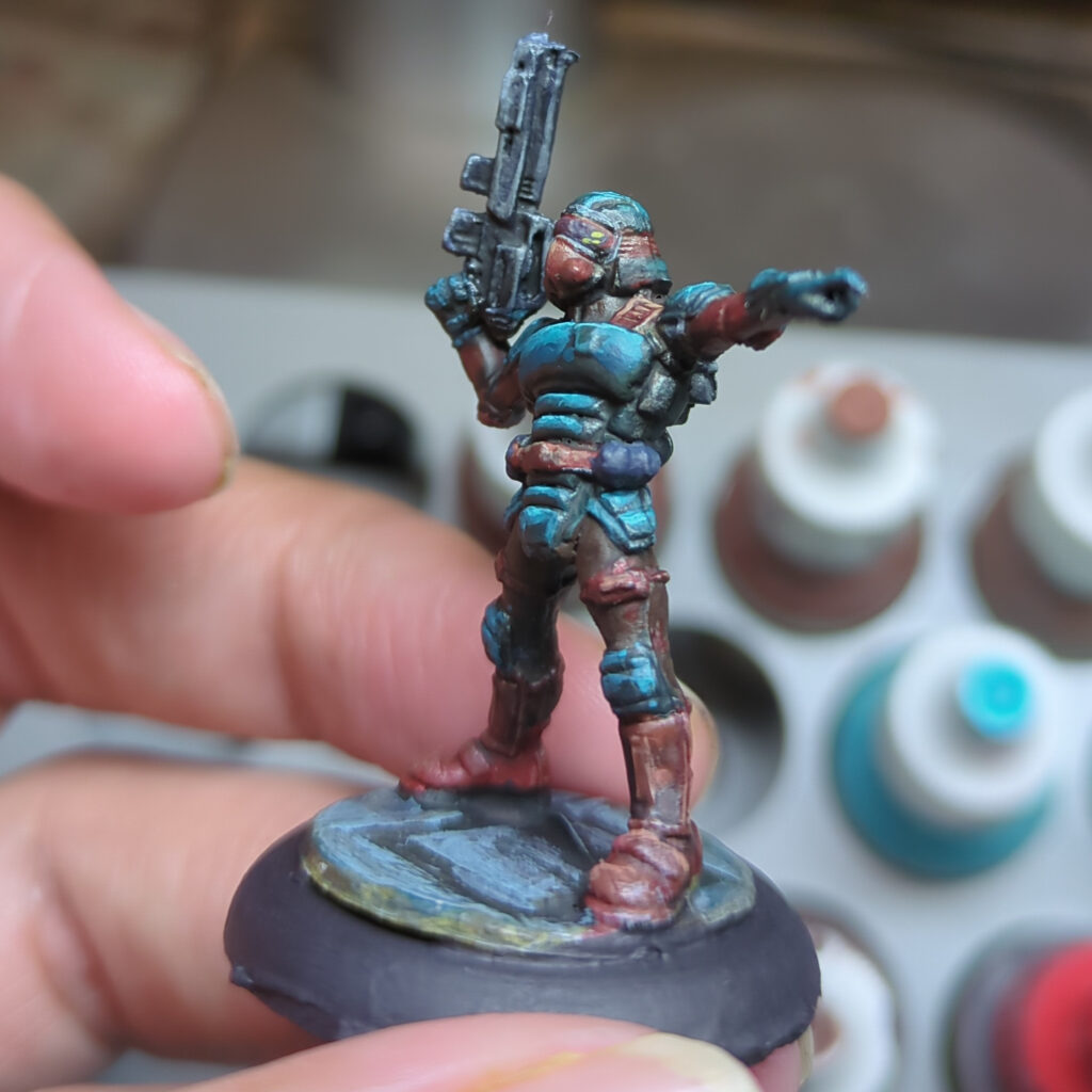
The Trooper

The last of the three minis was a sci-fi trooper figure from my pile of old Reaper Bones figures. I again chose to go with the more vibrant, higher contrast approach I went with for the pirate. Whilst that may not be the most realistic choice for a military uniform, it certainly produced a nice result. I do wonder if I could use this scheme for a StarGrave or Space Wierdos crew in the future.

This proved to be quite a fun experiment, and one I’ll probably repeat with other schemes in future. The teal and mahogany are both solid colour results that I’m sure to use in other schemes in the future, and I think I’ve learnt a bit of colour theory along the way.

A Useful Little Workstation

Back in November of 2022, I was just recently migrated off Twitter to Mastodon and was starting to learn about the rest of the Fediverse. Someone called Ari was just starting up a Pixelfed instance for mini-painting called, appropriately, miniature.photography.

My first post on the site was sharing my new portable hobby station. Just a simple MDF kit, but also spray painted to give it extra protection.

An mdf hobby station, fully assembled and painted gray. It looks shiny and new.

I put this together to make it easier to make good use of the rather small amount of hobby time I got (having a young family sure does kill most of your free time). It has its dedicated spot on the shelf which makes setup and pack-up relatively quick and easy.

That station is still with me today, though it now looks a little less immaculate. But it’s served me well so far. One of the minis is even the same in both pictures (for fun, see if you can spot which). I do tend to take a meandering approach to getting figures painted.

The same mdf hobby station, but showing clear evidence of paint spillage and other wear and tear.

Since then, Ari eventually decided that running an instance wasn’t for him. He’s given us all plenty of notice, so I figured it’d be a good idea to migrate some of the stuff I’d posted over there to this blog before the instance goes. You’ll probably see a few more posts where I go back and discuss old projects so I can ensure some of those photos remain available somewhere.

And thank you to Ari. Miniature.photography was my place to share my projects with others for quite a few years, and led to me discovering many other talented painters to follow within the wider hobby corner of Mastodon (frequently simply shortened to Hobbyodon). I could talk more about how wonderful it’s been, for now I’ll share a blog post from someone else whose captured it wonderfully.

Having a go at Non-Metallic Metals (NMM)

Whilst the simplest and easiest way to paint the metal bits on your mini is just to use metallic paints, there’s a whole other effect you can go for using nonmetallic paints to simulate the highlights and reflections. I’ve been interested in giving it a try for awhile.

My first attempt was a couple of ninjas, painted up to look like their blades are catching the moonlight. These were good to start with as the thin katanas made it a lot easier to get a good effect.

Two 28mm Ninja figurines, each painted to look like they’re sneaking through the night with the moon glinting off of their blades.

After these, my next NMM attempt kept the same theme but had a slightly larger surface to work on. For this attempt I focussed mainly on getting the right “shapes” and ensuring there was plenty of contrast. The final result is a bit rough – it looks good at a distance but is a bit messy when inspected more closely.

For attempt #3, I went with a more of a bronze/copper hue, painting both the weapon and the shoulder pads of a lich. My colour plan for this (based on Vince Venturella’s Copper NMM guide) involved using the following four colours:

  • Vallejo Game Colour Charred Brown (#72.045)
  • Reaper Master Series Gory Red (#09278)
  • Reaper Master Series New Copper (#09306)
  • Reaper Master Series Maggot Green (#09282)

This kind of worked out ok, but the very pinkish hue of the New Copper looked a bit wrong, so I wound up using a thin glaze of RMS Explosion Orange (#09219) to bring back more of a red and yellow hue. My first attempt looked alright, if a bit muddy, but I wasn’t completely happy with it. I then went back in and worked on bumping the contrast up a notch, which delivered a much better result.

The Halberd, first attempt on the left, with the right showing the result after bumping up the contrast

This is definitely just the start of my NMM journey, but so far there’s a few key lessons I can share.

  • It will look terrible right up to near the end, when it will start to look good (even then, it looks its best from a distance).
  • After you’ve placed your highlights expect to go back and forth repainting bits until it looks right.
The finished Lich, holding his awesome NMM halberd.